18
DESIGNING The Lunar Industries Logo
One of the most important pieces of graphic design work I had to do on Moon was the Lunar industries logo. As the film was designed to be remiscent of vintage period 70s and 80s Sci-Fi films, we had to have an evil corporation at the heart of our story. It was really fun making up an evil corporation for Moon, this subject area is something that Duncan and I have been dabbling with for a few years now and it was great to bring one of them to life and realize it on-screen. Evil corporations are great screen baddies.
I didn't have much time to get the graphics work done and so, as usual, the design for the logo was done very quickly. I spent about a morning working it up and went through some pretty bad designs really quickly, left it for a couple of days whilst I had other things to do that superseded it in priority at the time, then came back to it and finished it off in an hour and a half one evening after a pre-production meeting. When you're working like this, sometimes you just have to sit down and start moving your hand around making shapes and trying out fonts as there's no time to sit on a roof in a hammock watching the sun go down waiting for inspiration to strike. Consequently these original Lunar Industries logos are pretty bad but again, in the spirit of honesty and to show you what we really did behind the scenes here are a few of my initial rapid attempts at trying to get a handle on the Corporate Graphics.
Originally I was thinking I might go for something that looked kind of like an aerospace company so I was looking at working some flashes and little arrows and things into the design.
Then I was having a look at making things look a bit techy by drawing white lines through and breaking the fonts up to make things look "fast". I also worked in a round logo at the left, which is a circle within a circle. This is intended to be a graphic representation of the moon with the earth behind it to symbolize the companies' lunar mining effort. I imagine the first company to get up there and set up an operation like we see in Moon would be pretty keen to brag about it. Apart from the production line cloning and murdering. I'm sure Wikileaks would get hold of it sooner or later.
At this point it looked to me like there was a bit too much going on in the design. With the "fast" arrows, white streaks and the earth/moon logos all in there it was saying a bit too much so I thought I'd simplify it and try out a new font whilst I was at it. When you're trying to hone in on something it's usually better to change one thing at a time otherwise you can quite easily spin off into the weeds. I did that here and this one's pretty awful. Thing is, it was still valuable in the design process because it made me change the font again.
And that's where Green Mountain/Microstyle came in. I love this font. I'd used it a couple of times before and I thought I'd give it a go and we both liked the look of it. I was also trying to separate the lettering from the background with a box out here. This one doesn't work too well but it got me thinking along those lines of using negative space for the lettering, which I ended up coming back to later.
Next I tried this, which is just awful. I wanted something to frame the writing and thought I'd go for something that looked a bit "imperial" (which this doesn't really anyway). This was actually a worthwhile design to try as it scared me a bit. I thought this would look pretty cool in my head and as you can see it doesn't. This happens from time to time and I find it genuinely scary. This is always good motivator as it's guaranteed to make you review your previous versions and hone in on something you are confident you can get to work. Being scared is good for your focus, as long as you can hold your nerve. As an artist, the fear comes from doing a rubbish piece of artwork and essentially failing.
So from there I decided to have another look at the earth/moon graphic, as I liked the simplicity of the circle within a circle. The thing is, it didn't really have much common graphically speaking with the actual copy describing the name of the company. The two things tended to want to seperate from each other on the page. There is no design unity here and this makes it just look wrong.
I then tried another version where we see the Earth with a ring describing the moon rotating around it, which is also a Helium2 (regular Helium) atom. I like trying to work things like this into designs but this just doesn't work as a logo. It's not really got any strength or solidity and it's a bit scrappy and in cohesive.
I then proceeded to try and bring some weight and relevance to the double-circle logo as I felt it was worth pursuing. I do think it looks better darker and it's starting to sit a bit better with the text in this one. Giving priority to the word "Lunar" also felt like a step in the right direction and it was also really useful in getting the text to fit more into a block, as it's a more pleasing and tidy geometric shape. It still left me with the problem of getting a rectangular block and a circle to sit nicely together on the page though. I was trying to get back to aerospace/speed again here by putting the ghosted versions of the round graphic in to bring a sense of motion and speed, which didn't really bring anything to the design.
I like logos that also have an abbreviated, smaller version and I was keen to have this in the film, as I wanted to brand everything to create a corporate atmosphere. I really needed something pretty non-descript that worked as a little badge that I could put all over the place on clothes, props, walls, video graphics and everything. I had a little look at how the "L" and "i" could fit together and you can almost see my brain working in this "scrapbook" image above.
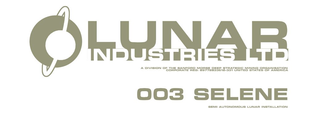
This is the first graphic I worked up to try out on the walls of the Sarang facility set we were building in Studio K at Shepperton. Incidentally, this is half of the massive studio they built for Lost in Space, which was a single space then but now has been split into two and comprises K and L stages. To give you an idea of how big they each are, we were shooting with the full-size complete Sarang set in K and "The Boat That Rocked" were shooting in L with a full-size mechanical ship mounted on a gimbal. Pretty big spaces. So as the set was being put together by the construction crew I was in there with our sign writer Julian Walker trying out bits and pieces of graphics on the walls whilst they were still painting it. This is the first sign I ever did and it was intended to be on the wall next to the main airlock so you'd see it as you exited the facility.
The writing at the bottom "003 Selene" is the original name of the Moonbase. Duncan had "Selene" in the original script but changed it to "Sarang" just before shooting. This means "Love" in Korean as he was seeing a Korean girl at the time and he was really missing her as we were getting Moon made. I put the "003" in there just as a little indication that there might be many more bases up on the Moon, each unaware of each other, each cut off from the rest of humanity and eagerly beavering away keeping our personal robots and electric hover cars charged up with delicious electricity. They would even be staffed with Sam Bells. I put the two zeros at the start of the number to imply that there might be as many as 999 other bases, each operating within it's own jamming field and each completely unaware of the others' existence. I did this on the clone room drawers too. Sam 7 (the one in the drawer they open) is numbered "0007", suggesting that there might be up to 9,999 clones in that corridor. This also makes him the "James Bond" clone. At one point Duncan and I talked about the possibility of a shot right at the end of the film where they all wake up and are trapped in the corridor. So there are 9,993 Sam Bells' all crowded into the corridor stretching off into the distance going mental. I think this could have been pretty cool. It would have been a hell of a suprise for the "rescue" team when they arrived. They'd have probably just blown out the airlock and de-pressurised the whole base and then got Gerty to clean everything up whilst they had a space-beer.
Next I tried putting in a bit of colour to see what happened. I've always liked the look of grey and white with an orange accent so I tried incorporating a little bit of colour into the design to see what happened. I liked the way it was sitting but it still looked a bit light and floaty. I also tried putting the rounded-off border in as a way to tighten things up and allow the graphic to sit off whatever surface it appeared on and have it's own space.
This next one was a little rough sketch I did to see how it looked going back to using the negative space. I felt I was onto something with the weight and finally decided to seperate paths from the round shapes. From here I went straight to what became the final design.
And there you have it. The logo abbreviated really nicely to the "Li" with the two orange squares and everything just clicked. Lunar Industries was born.


